



OOH OF THE MONTH AUGUST 2026
Out Of Home advertising gives brands a chance to experiment and take visual risks. Some of them work, some of them don’t. In this month’s look at Test Your Ad Outdoor we look at three ads which try something different and risky visually and explore where they go right, and in some cases the mistakes they make.
Successful outdoor ads often ask their audiences to do a little of the work of understanding. It’s the static equivalent of humor or wordplay in a video ad – part of the “putting on a show” that makes advertising both entertaining and effective. But there’s a balance between giving viewers enough to do that they feel engaged and entertained, and asking too much of them.

First, an ad that gets the balance right. The UK’s London Eye is one of the country’s most famous tourist attractions, a modern landmark that’s become as much a symbol of London as Big Ben. But the London Eye isn’t just something to be seen, it’s a platform to see from, and the new campaign “Book Breathtaking Today” from TBWA seeks to remind audiences that the icon is also a working attraction. It’s an opportunity to see the city in a way nothing else can match.
The risk this out of home ad is taking is simply not using the most iconic asset the London Eye has – its visual identity – and instead simply showing one of its space age viewing pods, floating above London with all the famous landmarks laid out in front of it. For the London Eye, the campaign is as much about reintroducing Londoners to the Eye as luring tourists, and among Londoners the campaign is a terrific success. It scores a 4.2-Star Rating on the Test Your Ad Outdoor scale with the custom sample of Londoners, predicting strong potential for long-term business impact.
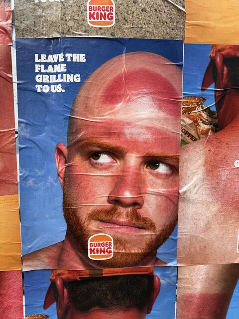
The ad’s key association with this audience is “London Eye”, showing that the decision to only show the pod and not the wheel itself has paid off, creating that strong association with no confusion among viewers.But not all out of home risks pay off completely. Over in Belgium, Burger King has created a divisive summer ad. “Leave the flame grilling to us”, it says, with the image of a sunburned man looking somewhat regretful. The patch of burned skin on his forehead suggests both a baseball cap worn backwards and the Burger King logo, which appears at the bottom of the ad.
It’s clearly a humorous ad pointing out that in the heatwaves that have tormented Europe there are easier ways to get flame grilled food than an outdoor barbeque. When we tested it, the ad performed very well on Brand Fluency – it’s an ad that leaves the audience in no doubt as to who it’s for. But the ad took the risk of showing an image likely to disturb or even disgust people, and emotional response is very divided. Here’s an example of where toning down the image or making it more obviously comical might have lessened the risk – and Burger King would still have come out as highly recognizable.

Our final ad also takes a risk with a clever visual pun. Busch Beer in Canada have invented a new form of advertising – baleboards, like billboards but based on hay bales not posters. The ad shows giant cans of Busch Beer lying like hay bales around a harvested field, making for an image that’s topical and visually arresting.
The dramatic image certainly gets people’s attention – the ad scored a strong Spike Rating on Test Your Ad, which predicts the short-term impact on sales of a poster or static ad. But there was a lot of confusion as to what the ad’s visual meaning actually was, as not every viewer made the connection with hay bales and many associated the ad with littering. This boosted negative sentiment. It’s a good example of where an explanatory word or two on the ad, to provide context, would have made it a lot more effective without damaging the striking image.
This month we have three ads with strong visual ideas, but the London Eye is the one that succeeds best in its aims, creating a strong emotional response amongst a key target audience. The other two are a tweak away from working very well – a reminder that you can’t make your audience do all the work, and that testing ads beforehand can help you spot when a great idea isn’t quite translating to a great ad.


Help us. Help you. Please click to subscribe

- Advertisement -


