


7 Fundamentals —Best Creative Practices Which Make Billboards Better
Clear Channel's McGraw on OOH Creative Success
7 Ways to Create Billboards that Spark Joy
Having worked in the #OOH industry for over 20 years, many of them spent right in the heart of Times Square, I have seen it all. Experiential events, augmented reality, 3D props that move and steam, characters in furry costumes, naked cowboys with guitars…you name it. The most memorable executions all have something in common — great creative.
Whether I am in a city walking by transit shelters, traveling through airports scanning baggage claim screens or driving around town passing bulletins and #posters, my eyes always gravitate up, looking for the best examples. It’s natural for me to scan the landscape for these larger-than-life canvases promoting new brands, products or services that are relevant along my journey. Over the years I have seen countless examples and the best ones always have something in common. They stick to a set of tried and true best practices.
“What can we do to make our billboards better?”
As I help lead teams of designers across the country, working with myriad brands and ad agencies, I have developed 7 fundamental ways any of them can have success when asked: “What can we do to make our billboards better?” I hope you find these easy to apply, and effective when developing your next out-of-home campaign to create impact, leave a lasting impression and drive consumer action.
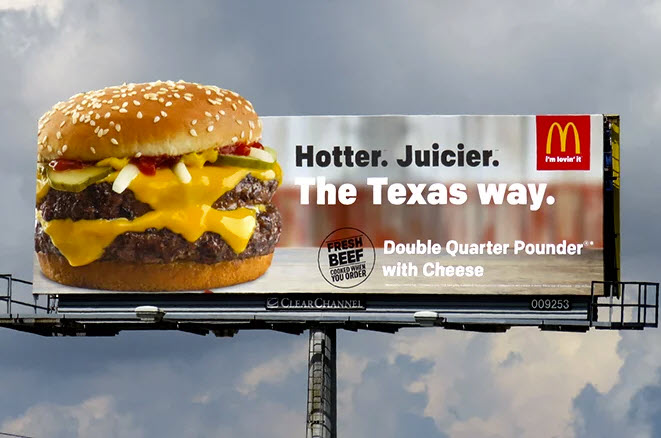
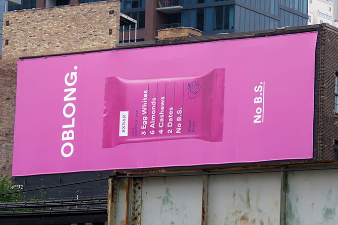
#1: USE BOLD SANS SERIF FONTS: Maximize size and contrast
This font is the easiest to view from the road and from a distance. If a passerby or driver can’t comprehend your message in a few seconds, the opportunity is lost.
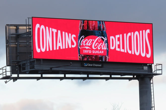
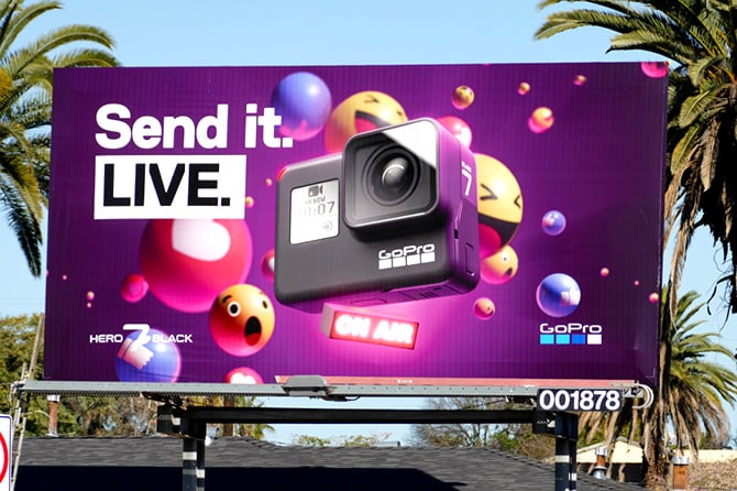
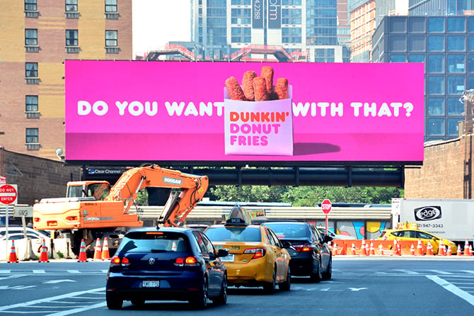
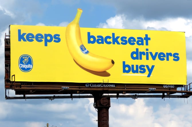
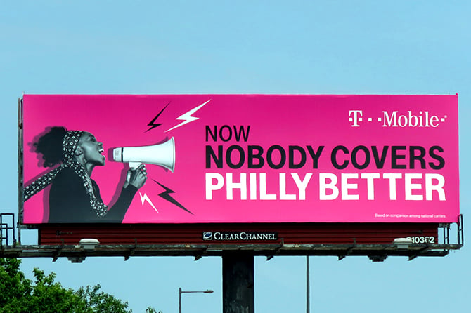
#2: CRANK UP THE VOLUME: Apply white text on vibrant backgrounds
Dunkin’ Donuts and GoPro know how to make it pop. Just look at the examples below to see how a consumer’s eye would be drawn to the sharp color contrast.
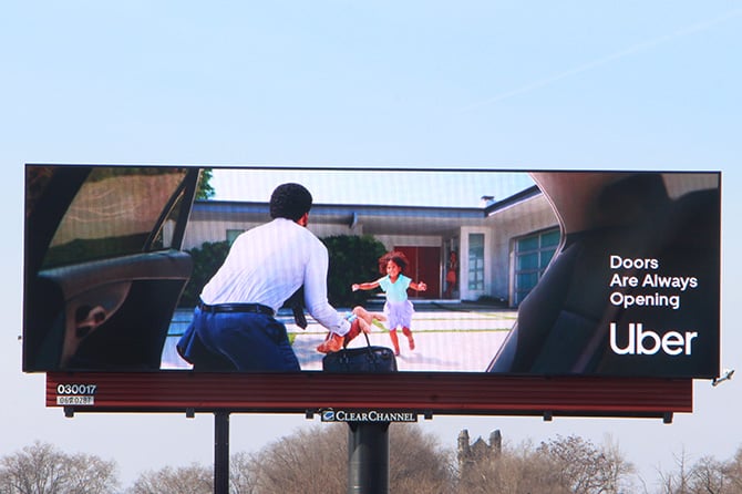
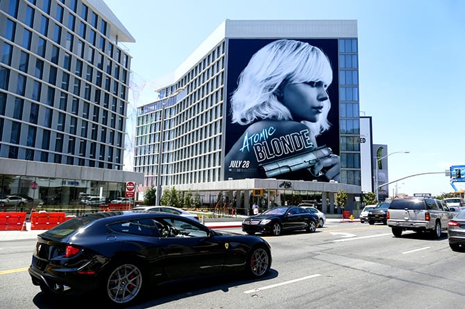
#3: IMAGE IS EVERYTHING: Use the full height of the billboard
The cliché, “A picture is worth a thousand words,” is a cliché for a reason, it’s true. Images make instant emotional connections. When less is more, have your image say what you can’t fit on the #billboard.
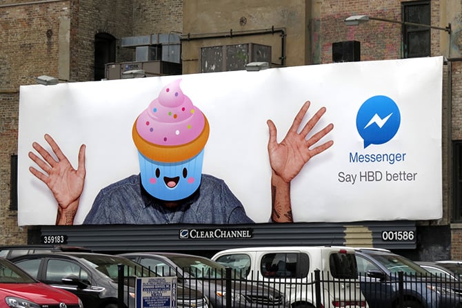
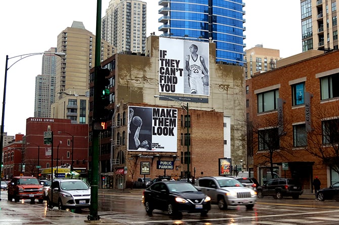
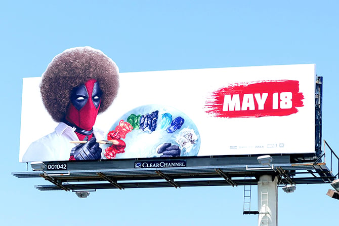
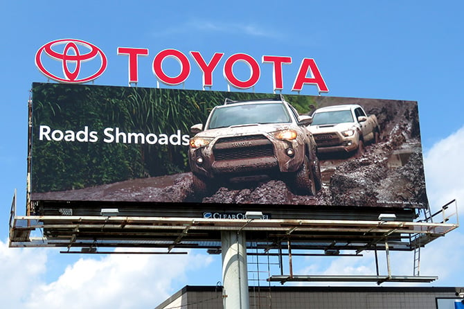
#4: STICK TO ONE IDEA: Communicate as rapidly as possible
You only have a few seconds to make a lasting impression. The best billboards do not stack the canvas with competing messages. They’re clear and want the reader to hone in on one key element that they’ll remember (or one key mystery they’ll question).
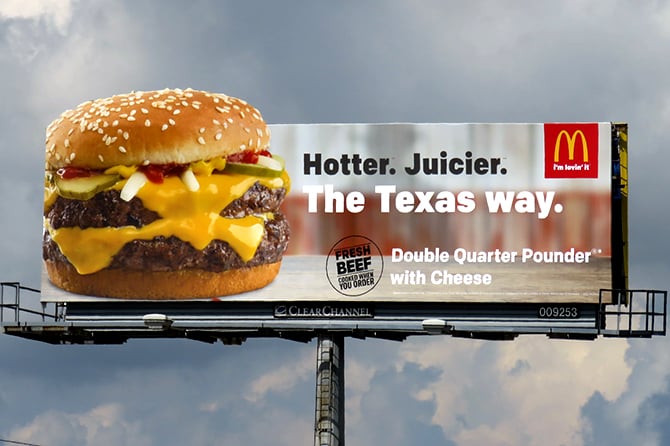
#5: USE SEVEN WORDS OR LESS: Make it contextually relevant
Less is more. Be concise and your campaign will stick. Be witty and it will be even stickier.
 s
s
#6: LOCALIZE YOUR MESSAGE: Consumers engage and recall increases
Localization provides instant recognition, like the billboard is talking to you personally, it knows you, knows what you like to eat, where you like to go…knows how your hometown outrocks your neighbors. This builds instant rapport and favorability.
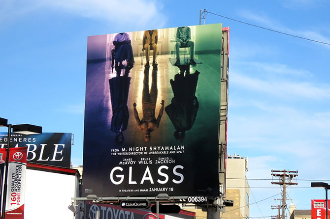
#7: CREATE A STRONG SILHOUETTE: Forget about the negative space
Silhouettes are art in themselves. The eye is naturally drawn to work out the shape, producing captivating creative.
Originally posted to the Look Up blog.

- Advertisement -


[…] some visuals, check out OOH Today’s guide to the creative process of standout billboards. Font, colors and size all […]