


Color and Typography Influence Consumers —Design Matters
It never hurts to step outside the Out of Home sphere just a little bit of time, to round out one’s knowledge. This is an easy turn to gain a deeper understanding on how color and typography influences consumers. Since most of your OOH has both type and color, let’s read up on the rules of design and see what the researchers, psychologists, PhD’s and other experts have to say. This through the easy to read infographic from MGD Advertising.
Just for fun let’s note what the #Big3 logo colors infer about them below→
Lamar Green- Luck, Nature and Wealth. Any arguments about that characterization?
Clear Channel Blue- Peacefulness, Depression and Love. Humm, some would argue spot on, others would say, total miss.
Outfront Purple- Royalty, Nobility and Honor. Interesting considering the British influence managing the company
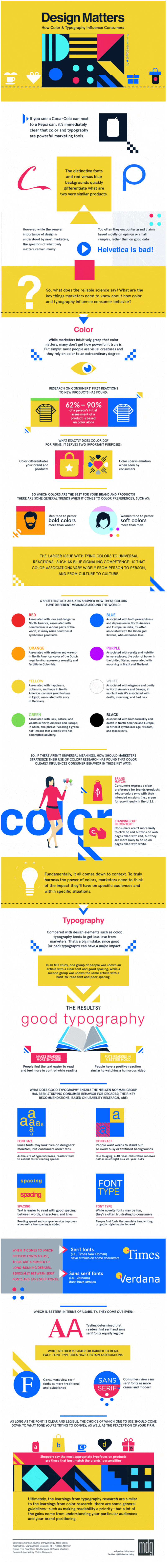
Paying attention to the little things like Font and Typography is important to the creative which is tantamount to the success any OOH execution. You don’t need to be the creative expert, leave that to your artist or creative director. Know enough to understand what works and why, to keep your creative team diligent and client’s happiness intact. The static info graphic is below.
Click here for the dynamic Infographic from MDG Advertising.⇒ Color and Typography Influence.

- Advertisement -


Nice nugget of info!
Thank you Jean-Paul. Its the devil in the details. Is there insight to the color of the Big 3?